On Friday, President Donald Trump unveiled the new Space Force Flag, marking the first new official military flag adopted by the Defense Department in 72 years.
Trump was joined by Defense Secretary Mark Esper, along with the Space Force’s senior enlisted leader, Chief Master Sgt. Roger Towberman and Space Force commander, Gen. John Raymond.
Does the logo look familiar?
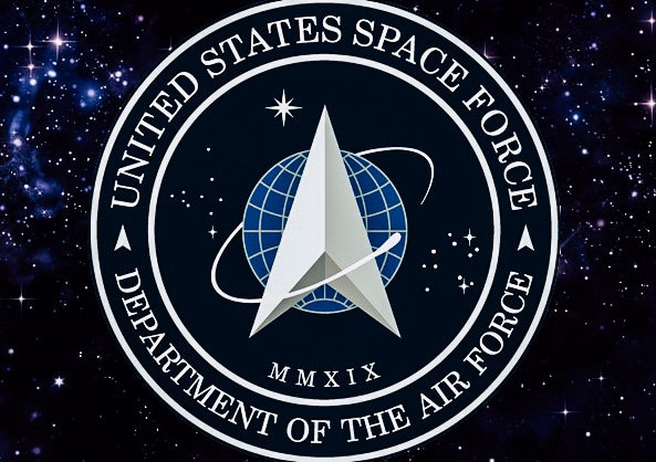
In January, President Donald Trump tweeted to the world that America’s newly minted Space Force had established an official logo. The image he posted with the announcement included the expected bits of language around the outer perimeter (“United States Space Force” and “Department of the Air Force”) but it’s the middle graphic that caught most people’s eye. The arrowhead graphic in the middle of the logo bares a striking resemblance to another famous space-logo… that of the fictional Starfleet Command from the science fiction franchise, Star Trek.
After consultation with our Great Military Leaders, designers, and others, I am pleased to present the new logo for the United States Space Force, the Sixth Branch of our Magnificent Military! pic.twitter.com/TC8pT4yHFT
— Donald J. Trump (@realDonaldTrump) January 24, 2020
Of course, it didn’t take long for the internet to notice the similarity and start pointing it out with the sort of sarcasm and wit we’ve all come to expect from social media.
Boldly going where we’ve gone before #SpaceForce pic.twitter.com/otq51c2yeJ
— Jackson Grimm (@JackCameraman) January 24, 2020
So did the Space Force really rip Star Trek off?
The simple answer is not really. While it’s impossible to pretend the two logos don’t look similar, the Space Force’s logo is only really guilty of ripping off the seal for the U.S. Space Command, which has existed since September of 1985, as a number of former Space Command troops pointed out.
For those excitedly tweeting that Trump stole the Star Trek logo!!!!, the patch on the left was the existing Air Force Command logo.
The same one I wore as a Lieutenant in 2005. pic.twitter.com/mYb60YioBP
— John Noonan (@noonanjo) January 24, 2020
As luck would have it, even the U.S. Space Force themselves addressed the pseudo-controversy in a social media post that broke down the different elements of the new logo and what they mean. Their explanation goes even further, perhaps because of people that pointed out that Star Trek was around long before 1985. The Space Force noted that the “delta” (as they call it) has been prominently featured on official Air Force emblems since long before Kirk and Spock first hit the air.
“The delta symbol, the central design element in the seal, was first used as early as 1942 by the U.S. Army Air Forces; and was used in early Air Force space organization emblems dating back to 1961. Since then, the delta symbol has been a prominent feature in military space community emblems.” The Space Force posted to Facebook.
But don’t just take the Space Force’s word for it. Notable Star Trek graphic designer Michael Okuda (the man responsible for the new Starfleet Command Logo established in the 1990s) also chimed in to defend the new branch’s logo.
“The arrowhead in the U.S. Space Force logo appears to be borrowed from the U.S. Air Force Space Command emblem, which has been in use since the 1980s,” Okuda wrote on Facebook.
“Arrowheads and swooshes and orbits and stars and planets have been used in space emblems long before either of these emblems. For whatever it’s worth — and I do not own the intellectual property rights in most of my Star Trek work — I’m not offended by the similarities, nor would I accuse the Space Force of plagiarism. I’m just amused. It ain’t that serious.”